Towers and Tribulations
Time for an update!
I have to apologize in advance if you were looking for my usual game design spiels. I've decided to write smaller posts with game design bits and thoughts, so they won't be peppered in this update. This post is just the story of the road Twilight Tower has traveled since the last update and some of the "water cooler" tales. Trust me, it's still entertaining!
Tiny Con
Sunday, May 22nd, we showed Twilight Tower at @SocietyOfPlay's Tiny Con 2022. It was a whirlwind. Many commented they couldn't ever find the seat open to try it. c0hil sold some prints.
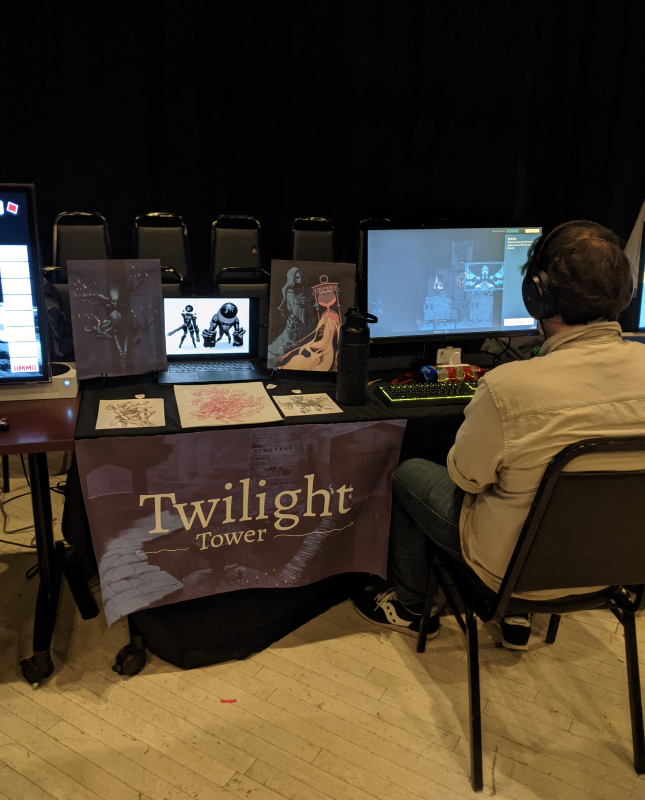
Nice to have an event milestone like that to push towards a build. In the course of preparing and testing for the convention, I made a lot of discoveries for the next round of game design. As always, with these milestones where we take a step back to re-evaluate the game design, it makes sense to write an update.
Where we left off
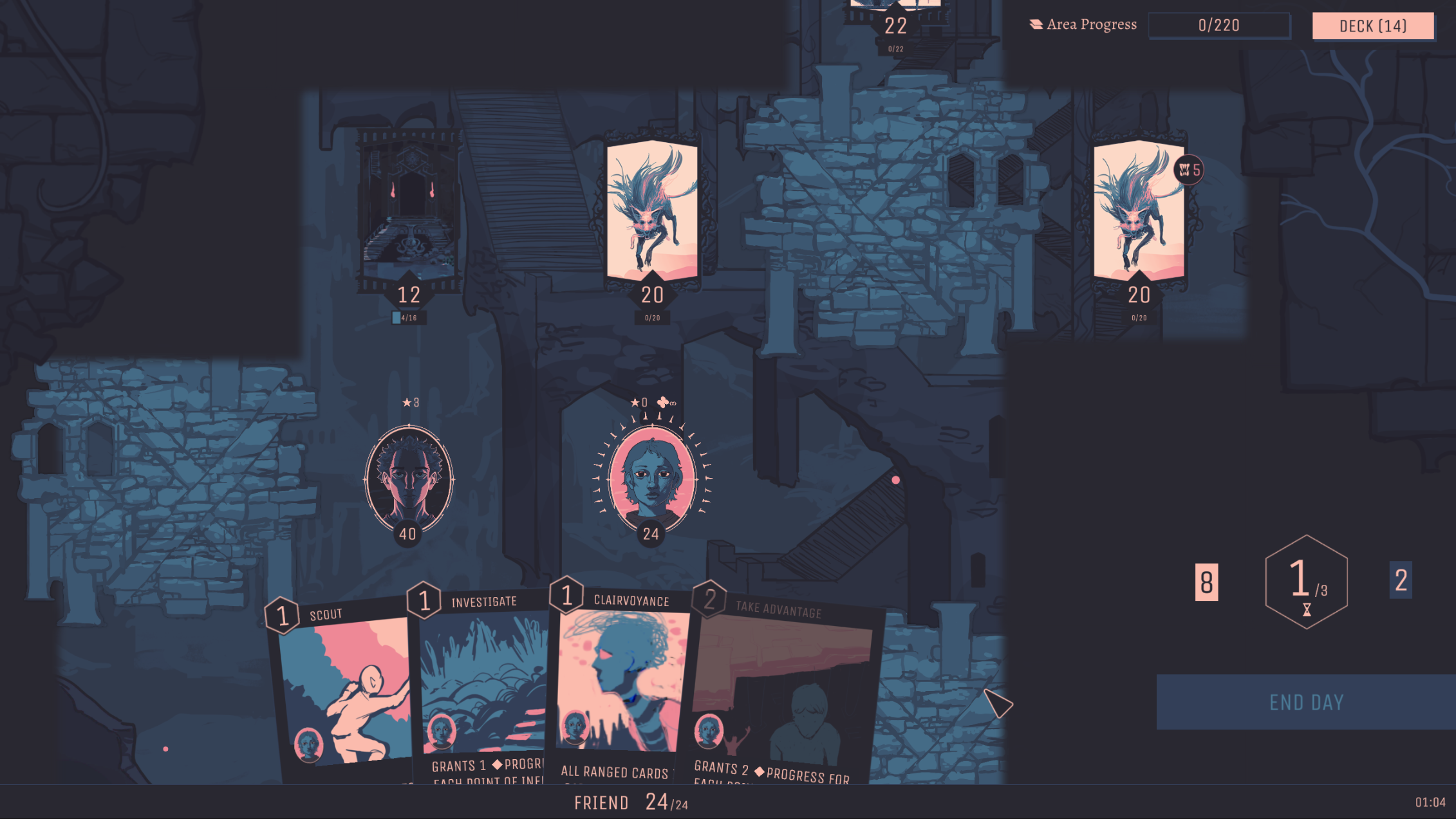
Last update was about how we were moving towards a more tactics-based grid layout. The first goal was to add a more repeatable mechanic that maintains it's novelty through many playthroughs. The second goal was to invent a new way to play deck builders, and at the time, I wasn't really seeing a game that used a combination of tactics and deck-building. I'm starting to see games do that now, but we've got a lot of mechanical differences, mainly:
- Exploration
- Teamwork
- The Sand
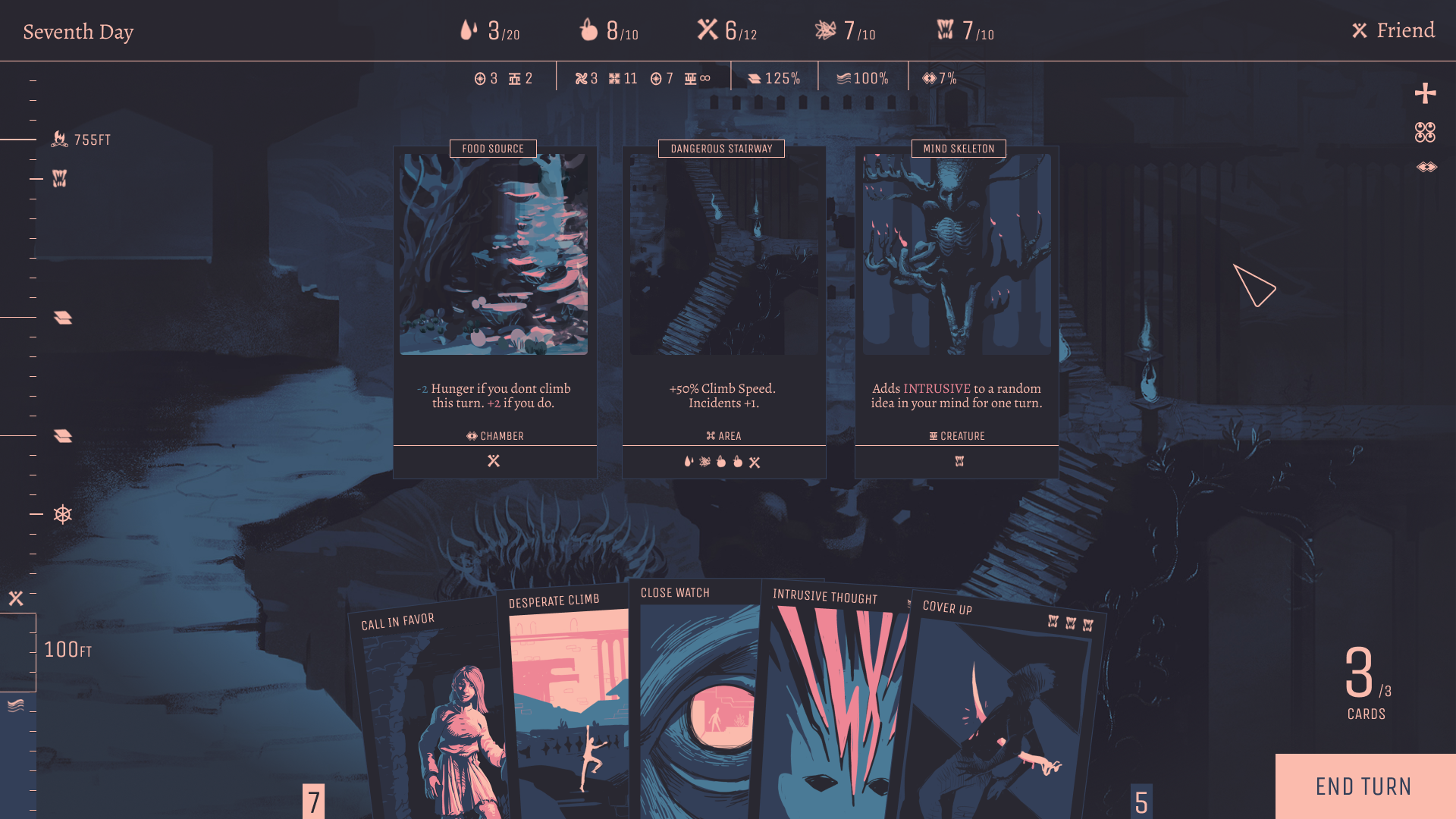
Moving to the new design led to huge pay offs in the mechanics department. You can now play a randomized map with a randomized deck and find yourself in endless novel scenarios, with only the basic content we've created so far.
We worked in a cycle of 3-4 weeks design and implementation, followed by test sessions, notes, and next cycle planning.
Triumphs and Tribulations
Within the implementation and test cycle, the biggest problem areas we hit were:
- The fact that we use the verb "Progress" instead of "damage".
- Presenting the "map" or world navigation.
- Teaching unique card mechanics.
- How to fit story into the mechanics.
- Range in a card game.
Progress vs Damage
In most games, killing is just a thing you do from start to finish. In Twilight Tower, killing is meant to be a big deal (holy fuck, you murdered that person!), so fighting and murdering your way through the tower in the mechanics would ruin this narrative idea. After a lot of experimentation, we landed on the concept of Progress, as in you are progressing through the tower but you have to get a set amount of progress to accomplish your tasks and navigate the tower.
It took a lot of tweaking to properly communicate this to players, but started to come together when we called all entities you encounter "Quests" as in something you need to progress through. (Fun Fact, like many verbs, "Progress" has a different meaning depending on which syllable you emphasize, a phenomenon I encountered in a previous game we made called Meta Form).
Sometimes players (and myself) slip and say, "I'm killing this cave! I'm fucking it up!!", but the overarching idea makes sense. Twilight Tower is about dealing in intangible ideas, rather than swords and sorcery. Sticking to this metaphor has been challenging, but worth it because the output is something more novel.
Map
The map you navigate is essentially "the board". Originally, the entire board was visible as you played. The problem was you could look ahead and plan your perfect route immediately and skip a lot. This design carried over from the paper prototype version where all the challenge cards were laid out before you and you'd progress up the tower. The other problem was that players would get to larger maps and say, "Whoaaaa, that's a lot".
The solution to this problem was to evaluate the feel of the game we'd like to see. The tower needs to feel more mysterious, like there is something unknown lurking out there. Like there are places to discover. You need to feel lost. This was the way the original jam felt because we never visually represented navigation. The position of your character was represented by the floor you were on, and that was it.
I thought back to the game Civilization, how the beginning of the game feels so exciting because just behind your field of view could be anything. Almost like being wrapped in a blanket of adventure and possibility.
So we changed from the board idea to a map. You still start at the bottom (near the sand) and work your way up, but you don't know what's ahead. The entire board is shrouded in darkness, and you can only reveal more tiles as you move, or when you use cards that grant vision.
This was one of the biggest instant improvement items. The feel of the game pulled closer to mystery and exploration and hidden dangers.
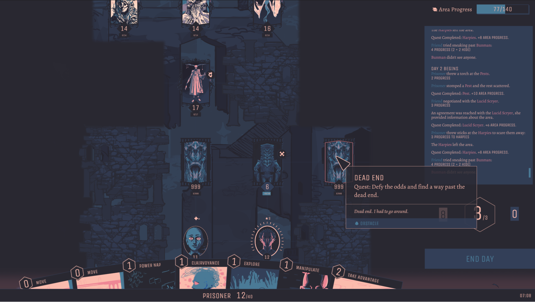
With this system also came camera panning and zooming.
Complexity in Card Mechanics
Another issue was simply getting players to understand what the cards do. I really wanted each card to have narrative flavor text on it, but not only was it ignored as the players learned, but due to the amount of text presented on the screen at once, players started ignoring instructions on the card as well.
This is always a tough lesson to learn. Over several tests I slowly reduced the amount of information shown for each card, simplified the descriptions AND mechanics of cards significantly. Also reduced the amount of mechanics present in any of the cards you initially find.
Game design really has much in common with education. How do you teach players to understand the base mechanics with the least amount of friction and confusion? Then, slowly pile on the complexity as they are ready.
Well, I assumed players would be ready for more complexity much sooner than it turned out.
At first, cards presented:
- A handful of unique mechanics
- Main card effect description
- Additional functionality description
- Flavor text
- Tagged mechanic tooltips
Where cards ended up:
- Less text on the card description
- More space around the text
- Larger text
- All other text removed except one or two tagged mechanic tooltips
- Only two unique mechanics: Influence and Momentum, which I can go into another time because they will likely keep changing
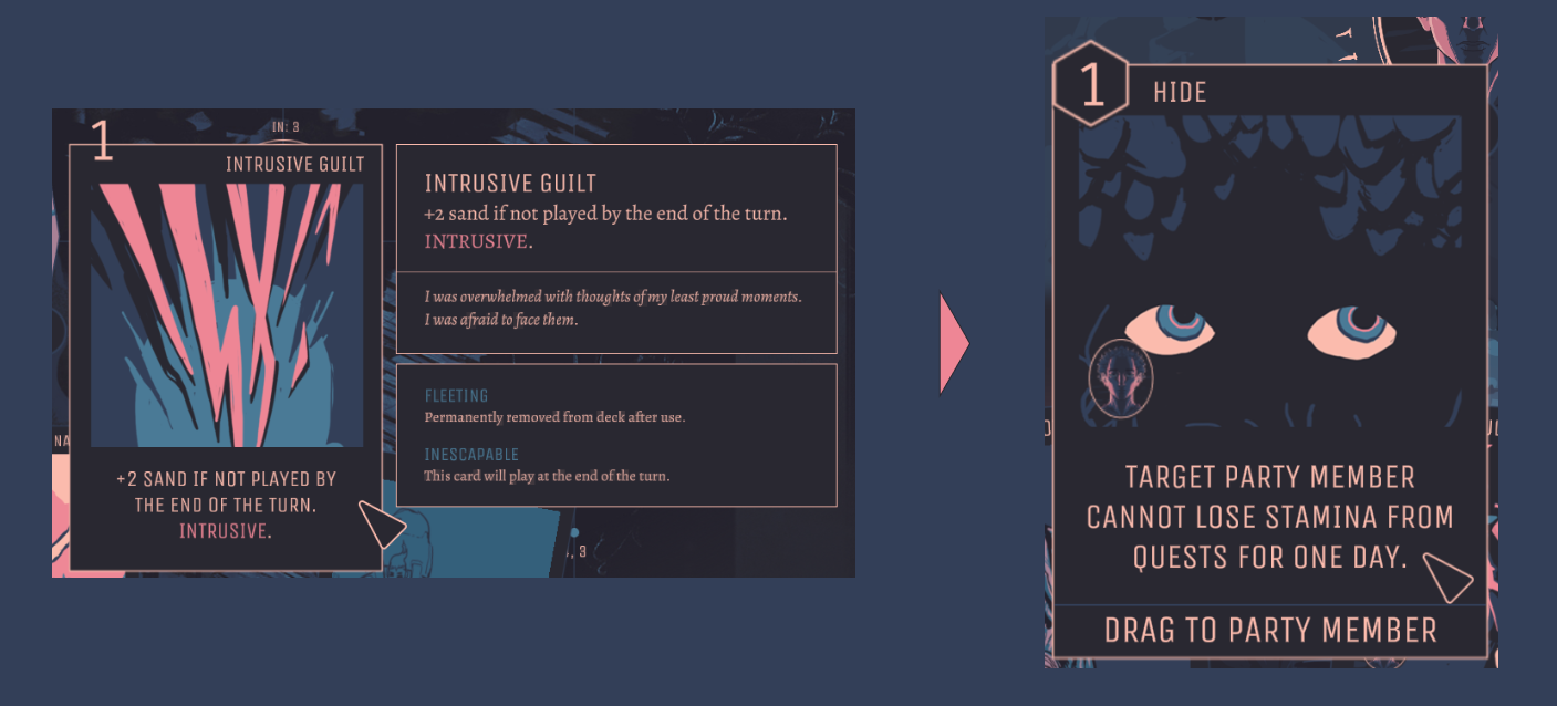
It's one of those situations when you know you probably should simplify more in the first place, but can't help it. Not only did I lack the insight to communicate to the player well, but also employed wishful thinking. I thought if I cleverly split up the text with some graphic design skills, I could fit in a lot more information. But no, it overwhelms.
Maybe in the future I'll allow you to click into the card to get some of those extra goodies.
As I move forward I will be adjusting the conceptual metaphors of the cards to better explain the mechanics so much of the understanding connects with our understanding of the real world. For example, a card that restores stamina and also boosts relationship with your companion, but heals more without the relationship boost if you use it on yourself makes more narrative sense with the title "Break Bread" than "Stamina Refill". Mark Rosewater of Magic the Gathering calls this resonance and that's a topic I'd like to meditate on further in a future post so I'll delve further into that another time.
Fitting Story in the Mechanics
I'll be honest, I haven't solved this one yet. I spent too much time stuck on programming. But towards the last few test sessions I started implementing and iterating on story to get a feel for the pacing. Players claim it works, but I'd like it to be a lot better.
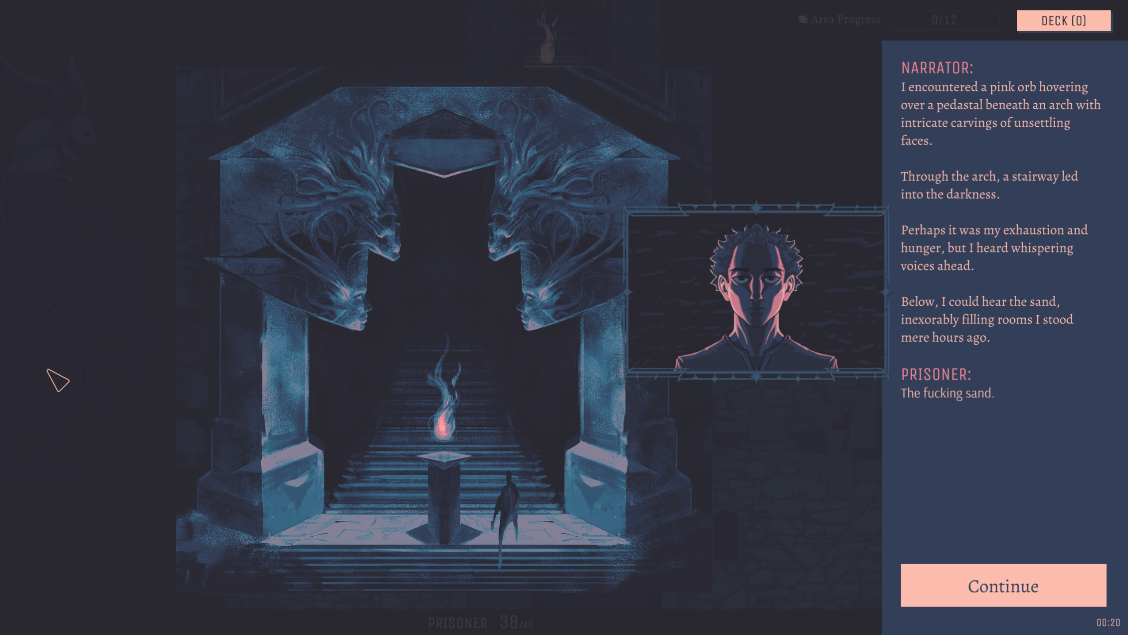
I'm already noticing some players are more focused on the card mechanics while others are more focused on the story. I'd like to get them better integrated, but It often feels like the last priority when programming and game design takes so much of my time.
The next phase will address this.
Range
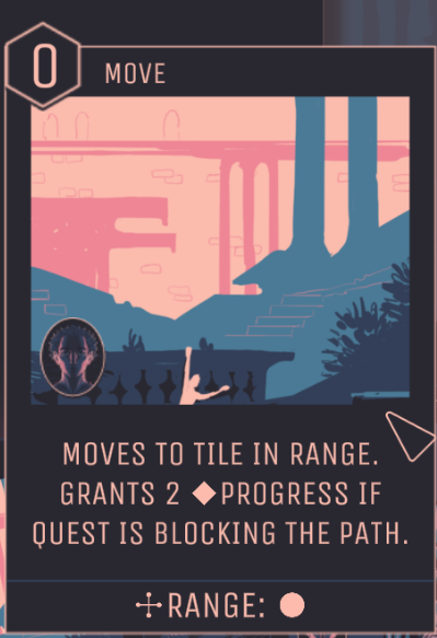
Range was and is probably the hardest mechanic to explain to players.
Additionally, since there aren't really any games that do this style of tactics-based card game, there's not many examples of range in other games to draw from.
In play tests we heard a lot of "Why can't I play this card?" (Because you're dragging it to a tile out of range).
I added so many UX helper systems after each test session to make range just a little bit easier for the next tester. Let me see what I can list off the top of my head:
- When you hover a card, it draws lines and highlights all the tiles you can drop that card on.
- Gave cards a special area that's dedicated to displaying Range.
- When you drag a card, an indicator displays the range of the tile you're dragging over vs the max range you're allowed to drag to, with text color that indicates if dropping is allowed or not.
- I created a system that explains how to use the card - either displaying the range of the card or that you can drag it directly to a player, or you can drag it directly to the screen.
- A character that has additional range so you can experience the difference of having more or less range between your characters.
- Tons of different error messages that cover the entire screen when you try to drag a card to a tile that is not allowed that explain exactly why what you tried isn't allowed.
- Tutorial messages encouraging you to use a ranged card across a gap.
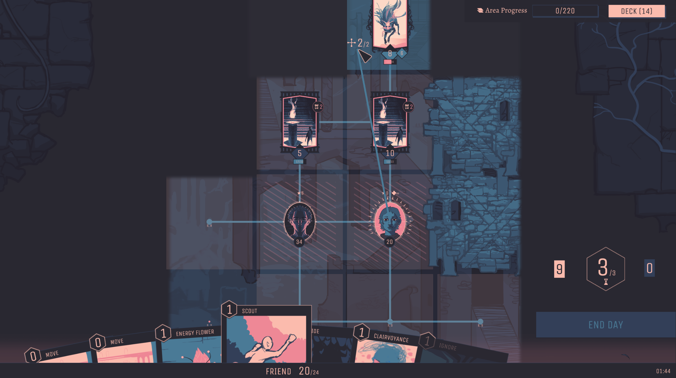
There is more than can be done and will likely be added over time, such as:
- Animations when you drop cards showing the card being used almost like a projectile from the starting position to target position.
- Diagrams on card tooltips showing the progress the card can gain at each tile position and what's not in range.
- Challenges that can only be solved via ranged cards.
- When you drag a card, shrink it and overlay it on the character using it so that the arrow pointing to the target is coming from both the card and the character.
I can always create more UX improvements, but at a certain point you have to decide during game design exploration if you need to spend more time on the overarching game design first and act as the tutorial in testing sessions. A lot of software startups do something like this - they pretend the system is automated or controlled via AI, but it's actually a human manually doing everything just to simulate the experience to gain insight into the software without having to build too much before proving viability.
The Results
What's next?
What's next for Twilight Tower? Maybe it makes more sense to talk about what was great in the jam version that's missing from the new version:
- Desperation
- Risk vs Reward morality
Twilight Tower Two
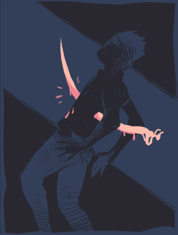
One of the first things testers who have played the jam version of Twilight Tower have said when they see this new tactics mechanic is some variation of, "Oh wow, this is a completely different game. Okay."
It's a strange and humbling thing to spend an entire year working in the shadow of a game that you made in two weeks.
Maybe we should append "Two" to the game title and start saying Twilight Tower Two. Someone told me that has a nice ring to it and I might take them up on it.
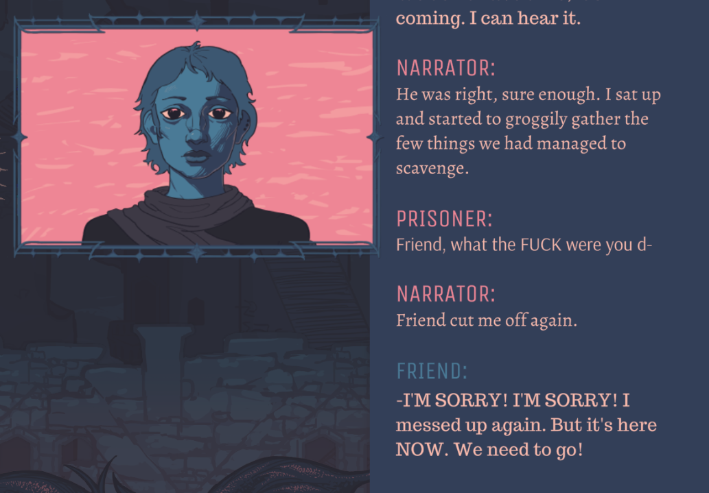
The other phenomenon is that players of the jam version have a clearer memory of what made it good. It's a great privilege to have fans of the jam version that are happy to act as time capsules to those humble beginnings. They talked about the experience of the jam version and the dark places it made them go, how they became a terrible person simply to survive. Unfortunately, that dynamic is missing now.
The transition to the new design brought huge payoffs to the mechanics, but the vibe suffered the loss of it's gripping desperation. I guess as I got sucked in to programming the tactics mechanics, the game design part of my mind began to lose grasp of the core feeling of Twilight Tower: Having your morality stripped from you by desperation.
Really Though, What's Next?
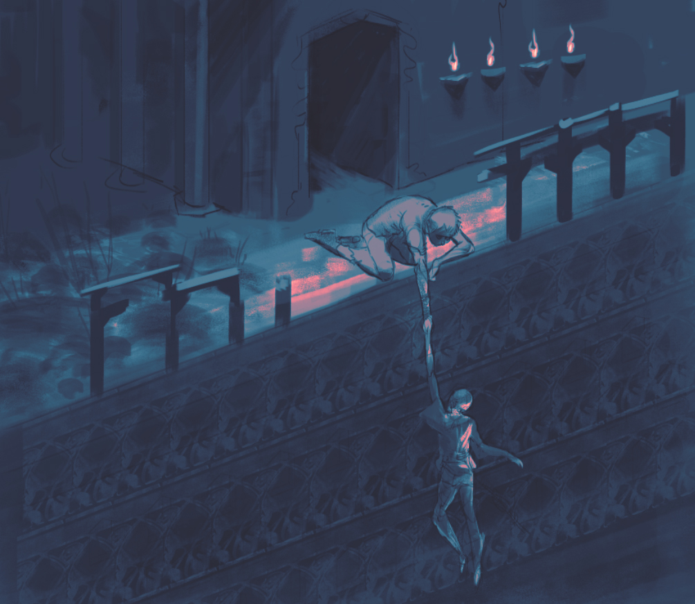
Getting back to the question of what's next, the next big goal is the game design: Getting back to the original feeling of desperation. Twilight Tower Two should feel like a proper successor to Twilight Tower One.
There is much experimentation planned, so that's the next phase: Just a ton of experimentation. I realized that some of my experimentation right before this tactics version will come in handy now that I can re-contextualize it through the lens of the current version. I'm super excited about it. If it works out, it will have a very novel feel.
The goal is to communicate the feel of desperation via the mechanics like the original jam, but in the tactics grid scenario. The classic game design risk vs reward will be the risk of doing the right thing vs the immediate reward of doing the wrong thing. In life, doing the right thing is often much harder, so Twilight Tower Two will play with that idea.
A few top of mind mechanics to explore:
- As mentioned before, desperation in the core of the mechanics.
- Stats - Bring back stats like distrust and danger and etc, but re-contextualized within the current system. It makes a lot of sense that if you want to use a card that treats someone like shit, there should be some greater disadvantage, such as your relationship with your companion growing worse or the tarnishing of your reputation.
- A "boss battle" - the amalgamation and ultimate challenge that puts everything you've learned so far to the test.
- More cards based around teamwork dynamics
- More story events and story based around how you're playing
- Betrayal
Organic Development
All that said, I'd like to emphasize that the game design feels good already. Like I could just add more mechanics and challenges and throw in some Slay the Spire style relics and tweak the game loop just right, but I want it to have that extra something special. As I mentioned in the last update, I'm using the organic development method, which relies on critique and revision. Devs like Blizzard North (Diablo), Sid Meier (find the fun) and Subset Games are major influences on this process.
"In practice, master plans fail - because they create totalitarian order, not organic order. They are too rigid; they cannot easily adapt to the natural and unpredictable changes that inevitably arise" -- Christopher Alexander
My next goal is to have a version where I feel like most of the game design is great and ready for content to be dropped in. At which point the project switches from exploration mode to production mode focus.
Know a Programmer?
Seeing as how I keep getting tied up in programming and losing grasp on the game design and narrative, I realize what this project needs most is a programming partner. This would free up so much more time for me to focus on giving the game design and narrative the TLC it desperately deserves.
The other two members of the team are the artist (who grabs everyone's attention) and the musician (who gave Twilight Tower it's feel), and I'm handling most of everything else, which is becoming unwieldy. So if we're to do this right, a programming partner would really help this project take off. Maybe I'm just jealous whenever I see teams like the Subset Game duo talk about their collaboration process.
So if you or someone you know thinks we're cool and is interested in joining us, either as an equal partner or as a consultant or mercenary, please send an email to boz@aesth.games so we can talk about it.
Special Thanks
I realize I've been talking about this project as though it was just me and a couple others, but really it takes a village to raise a video game. I want to take this time to thank all of you who helped test (and hopefully don't mind continuing to test) the game as it develops. I want to thank all the fans of the jam version and those of you who are patiently waiting to test what we're working on. Trust me, if you've asked to test the game and haven't been asked yet, it's because I'm very concerned about impressing you and not letting your expectations down! But we're getting there! Another extra special thank you to those of you who reached out with programming advice and walked me through your card game code! Holy shit that's such a privilege!
Also, thank you so much to those of you who are recommending edits to this update :)
-------------
Thanks for reading!
In the future I'm going to try to write more about individual game design topics so there's not giant gaps of silence anymore.
--------------
Updates in your Inbox
If you’re reading this via a link and want to be notified of future releases, please signup for the newsletter: https://www.getrevue.co/profile/aesth
Follow these people:
- c0hil does the art: https://www.instagram.com/c0hil/?hl=en
- Haberworks does the sound: https://soundcloud.com/haberworks
- boz wrote this post. follow his dumb tweets: https://twitter.com/huminaboz
Come hang out in the Aesth Discord (that’s my discord channel). Come hang out in the Society of Play Discord.
Get Twilight Tower (post jam version)
Twilight Tower (post jam version)
A survival horror/roguelite/dark decision-making card game hybrid where morality conflicts with survival.
| Status | In development |
| Author | Boz of Aesth |
| Genre | Card Game, Role Playing, Strategy, Survival |
| Tags | Deck Building, Horror, Multiple Endings, Psychological Horror, Roguelite, Survival Horror |
| Languages | English |
More posts
- What I'm Saying When I Say 'Game Design'May 25, 2022
- The Highs and Lows of Game DesignOct 22, 2021
- 2021/05/22 BugfixMay 22, 2021
- Concept Art & Game Design PlansMay 19, 2021
- 2021/04/30 UpdatesApr 30, 2021
- 2021/04/24 UpdateApr 24, 2021
- 2021/04/23 UpdatesApr 23, 2021
- Twilight Tower Updates & Future PlansApr 04, 2021
- 2021/3/27/UpdatesMar 27, 2021

Leave a comment
Log in with itch.io to leave a comment.